
Nowe: A UX & UI Project
An app-based transaction record system
An independent UX & UI project
Done under the supervision of Prof. Dhananjay Bisht
at Department of Industrial Design, NIT Rourkela
About the Project
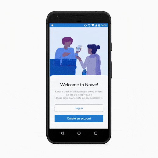
Nowe is an app-based solution for hassle-free record keeping of credits/debits at the consumer level
My Role

The Problem
Rahul is a 1st-year undergraduate student who lives in Hostel-3 at NIT Rourkela. He regularly buys snacks and food from the night canteen in front of his hostel to break the monotony of the mess food. Usually, he and the regular customers of the night canteen make purchases with a promise to pay later on. But one fine day, the canteen owner seemed very reluctant to let Rahul buy something on credit.
When he enquired the owner about his reluctance, he got to know that there were several customers of his who kept on dodging the reminders to pay the pending dues and there were several others who either forgot the dues or argued with the owner. The root of this problem lies in the unorganized way of record-keeping which most contemporary shops and kiranas adopt across India. It is inefficient and also isn’t considered credible by many.

A Day Canteen at one of the hostels at NIT Rourkela


Users Speak
As a hosteller who uses the credit facilities of the night canteens and shops often, I hold a certain opinion about the present process of credit and lending but it is necessary to think of other regular credit facility availing customers and their opinions before deciding on the design of the app.
I had a 1 to 1 conversation with my friends and acquaintances first, about how they felt about the current process and what their difficulties were. Let’s see what they had to say:
Research
Businesses in India
According to a study by RedSeer, 13 Mn kiranas form the backbone of this retail in India. A single corner store (kirana in Hindi) serves 100 Indians, yet three out of four of these mom-and-pop stores have no exposure to technology platforms for payments or procurement.. (Source: Economic Times)
Now, most shops be it kirana or night canteens fall in this category. They still depend either on ledger books (khatas) or solely on their memory. Though the former is somewhat accountable, it can still lead to arguments due to lack of credibility. Also, it is not eco-friendly and with the advent of digital platforms, it’s the need of the hour to move ahead with technology.

"I once had a bill of 300 at the DBA Night Canteen. Due to server problem the owner told me to pay later and we both forgot about it. On my 12th visit after about 3 months, the owner reminded me about that."

"I usually have all the dues written. So I know how much to pay to whom. Yeah, sometimes I don't have money at that moment but I always note it down."

"I once forgot my wallet in my room and hence bought some biscuits worth 50 rupees. I promised to pay later but then the COVID outbreak occurred. I am yet to pay him."
Customers' needs
One thing that can be observed is that most customers prefer kiranas/small shops not only because of their proximity but also due to the credit facility offered.
The customers however usually tend to forget the due amount if it is more than a week past the date of purchase. So, they need something to remember the exact amount and also remind them regularly about the due money.
Business owners' needs
One of the most important things for a business to run is Cash Reserve ratio. Things get worse if the credit that the shop offers isn’t repaid in time because of the imbalance in the ratio.
Businesses would ideally maintain a ledger book or khata. But they too have their own limitations. It is inefficient and the customer too doubts it sometimes. So a digital record that stays both, with the owner and the customer would pave the way for an efficient and more reliable crediting system.
Conducting User Survey
-
The short 12-question survey was filled by 40 respondents.
-
It was found that digital wallets (like GPay, Paytm, etc.) were the most common mode of payment (62.5%) followed by Cash which half the respondents used often.
-
While 35% of respondents said Laundry services provided credit facilities, the percentage was 32.5% and 30% for Restaurants and Shops respectively.
-
72.5% of the respondents reported that they have used credit facilities before.
-
While 75.9% of survey-takers cited the lack of change for credit, 69% said they didn’t have enough money at the time of purchase.
-
82.6% of the respondents said that they owed ₹10-₹100 to shops/businesses.
-
About 45% of the respondents told that they forget the amount they owe.
-
Only about 14% of the respondents place full faith in the shop’s records of credit.


Empathy Mapping
I made an empathy map with the feelings and activities of users throughout the process of owing and lending which is very common in both rural and urban India in case of kirana shops.
The empathy map helped me gain a deeper insight of a wide range of users rather than that of specific people or groups.

Personas
Based on the user research, I identified 3 major groups of users and made 3 personas corresponding personas:
1. Shopkeeper: Manjunath
2. Student: Kiara
3. Homemaker: Anitha
-min.jpg)
-min.jpg)
User Journey Map
I chose the housewife persona for the user journey map and took a general scenario into account while working on this.
User Journey Map

Competitive Analysis and Brainstorming Solutions
I carried out a competitive analysis of the features of 5 popular apps relevant to my project followed by pain-points identification and grouping those pain points for a better understanding. After thus, I brainstormed for solutions, and then grouped and prioritized them. This formed the basis of the further steps in the project.

.png)


User Flow
This flowchart is a representation of how the process would take place. This would happen if a user wished to pay the shop/service/business anytime later due to any reason like usual tendency, forgets to bring money etc. The shopkeeper records the owed amount which then appears on the app of both, the user and the shopkeeper with due amount, due date and all other details.
The user receives reminders to pay and also has an option to pay the amount digitally later on if by any reason he cannot visit the shop/service again. The shopkeeper can also set a limit and cap the maximum credit that a customer can avail.
.png)
Design
Logo Design
With the little experience that I have in visual design, I sat to have a minimal and sleek logo-cum-wordmark for the ‘Nowe’ app. I have embedded 2 principal elements in it.
i.At the confluence of N and O letters, I’ve tried to depict a man who has bent down (with the intention of writing). This is an indirect reference to the khatas.
ii. For the letter E, I have 3 thick bars in its place, which is a direct reference to records. The app has transaction records so I thought of showing this in a minimalist way
Moodboard
Just to analyze the emerging design trends, UI elements and inspiration for my UI design process, I looked up a few designs that appealed to me and added it to a mood board on Figma. I took existing apps, Behance case studies and Dribbble showcases into consideration in my UI inspiration mood board.
.jpg)

.png)
Wireframing
After completing my research, I could gather useful insights about the problem and also had a rough plan in my mind.
Sketching is a good way to think and iterate quickly. It helps in generating ideas and in synthesizing the insights from the research I did, at the same time. Later, I made them on Balsamiq as well.


User-Testing Wireframes
I tested my wireframes by sending a copy of the interactive Balsamiq wireframe to 4 of my acquaintances and assigning them 3 tasks on it:
1. Add a new transaction and return to the home screen.
2. Go to transaction history, use the Filter option and return to the home screen
3. Go to notifications, click on one of them, and then return to the home screen.
User-Testing Results
-
Users were mostly comfortable using the interface, primarily because of minimal options.
-
Users found the icon of ‘transactions’ a bit difficult to decipher.
-
Users expected notifications to open upon clicking anywhere on the tab, and overlooked the ‘Details’ link on the bottom right.

%20(1).png)

.png)
Color Palette
I researched on color psychology and found that blue would be the most apt color for the design system. Nowe is a digital ledger or khata and khatas have always been associated with a sense of trust and reliability between the customer and business owner. I had thought of introducing orange into the palette too but did not do so, as it would result in too many colors and people tend to not like orange.
Font Selection
I started off with a mood board of fonts. Upon further research, I found that Google Fonts would be a better choice as they have faster loading speeds. I zeroed in on two fonts - Lato and Nunito and finally chose Nunito. It’s rounded edges lend it a ‘friendly’ personality. This is a reference to the core nature of kiranas towards their customers too. Also, I’d have gone for Lato had the app been a text-heavy one. The other fonts I was interested in were Roboto (too ubiquitous) and Montserrat (font width was pretty high by default).
.png)
%20(1).png)
.png)
Iconography and Color Contrast
I downloaded all the icons from Noun Project, an open source website for all kinds of icons. I tried to have consistency in my icon set and had to make a few myself so that the thickness of lines did not deviate.
WCAG Guidelines for Level AAA states the that the visual presentation of text and images of text has a contrast ratio of at least 7:1. And for for large-scale text and images of large-scale text have a contrast ratio of at least 4.5:1; the app’s color contrast meets the AAA level, which is the highest level of conformance to the WCAG guidelines
.png)
UI Design of Screens
-
The very first iteration I had of the app had only symbols to indicate the nature of transaction.
-
But, all the cards looked similar, when not viewed carefully. Also, the same neutral color of the card everywhere looked bland and unattractive. Keeping in mind the lack of time people usually have during shopping, color was the next go to option for me.
-
So, two subtle yet contrasting colors were made use of, to help in differentiating the two principal kinds of transactions in the app.
-
The symbols too might be confusing for a new user, so I put a text description as well to enhance recognition.
Ethics: The red color is the more noticeable one and it signifies owed amount. I kept the color scheme with the theme that you before me and them before us.


Prototyping
The actual prototyping, which is linking all the screens took about a day and a half. In this process, I also had to design some additional screens like overlayed screens, radio buttons, etc which I had missed out on the first time I sat to design screens.


Testing
User Testing
I preferred to use an unmoderated remote user testing method and used the Useberry plugin in Adobe XD, which allows one free user testing project. I carefully picked the 4 most frequent tasks which a user is expected to perform on the app. These were:
-
Create a new account as a customer.
-
Add a new transaction.
-
Check the notifications, click on the top one and then return to the home screen.
-
Go to the transactions tab, click on the topmost transaction and then return to the home screen.


Conclusions from User Testing
From observing the overview of individual stats, I could identify that 2 users out of 4 had a lot of clicks. Upon closer observation of screen recordings, heatmaps and user flows I found that this was on the add new transaction page and it was due to the homogeneity of color, font and size of the ‘Back to Home’ and ‘Edit’ buttons. Since the later is rarely used and the context is known straightaway, I chose to separate the two buttons through color and made the edit button light grey.
.png)
User Testing Feedback
I received concrete feedback and opinion from two of the test participants:
-
User-1: “I don’t really trust shopkeepers in this age and feel that they might make dummy transactions of small amounts as I may or may not check app notifs often
-
User-2: “It takes a lot of scrolling to browse through the frequent transactions people list”
The next step was to act on it and make small changes to the first iteration. For the opinion of User-2, I got an idea straightaway but for User-1’s opinion, I had to brainstorm a bit before reaching a feasible idea.
Subsequent Changes
1. To reduce scrolling effort in finding frequent transactions users, I made a dedicated page for it. I first thought of having 7-9 frequent users on the home screen itself, but it’d have made the more important things conspicuous and hence decided against it. I kept 5 people on home screen with an ‘See more’ button to go to a page with all those who have transacted more than once in descending order of number of transactions.

2. To improve trust and credibility, I added a unique QR code of each user. This would make it impossible for a shop to add a transaction in the absence of the customer or in other app usage scenarios. The QR code scanner will also help to reduce the effort of typing user’s full name and also avoids errors of usernames which can lead to wrong transactions. Hence, it not only increases trust but also reduces errors in data entry.

Key Takeways
-
Test, test and test: This one thing ensured that flaws in the design were detected early in the process and rectified in the early stages itself.
-
User is the king: However strong our hypothesis may seem, we must proceed after some user research. Also, it is quite helpful to involve users at not just the final user-testing but also in the intermediate stages.
-
Go beyond just user opinion: 1 of the 2 major flaws detected during user testing of high-fidelity prototypes was discovered through observation of recorded video and heat maps. It helps to not just ask users about their experience but also keep a track of their usage and observe it.
VIEW NEXT PROJECT

